Wikipedia with a design twist: as a magazine.
A very unique design problem: create a book/magazine directly from the contents of a Wikipedia article. The initial parameters were pretty strict, only single-color + black could be used, and the final result needed to be able to be printed at volume for distribution as a magazine.

Approach
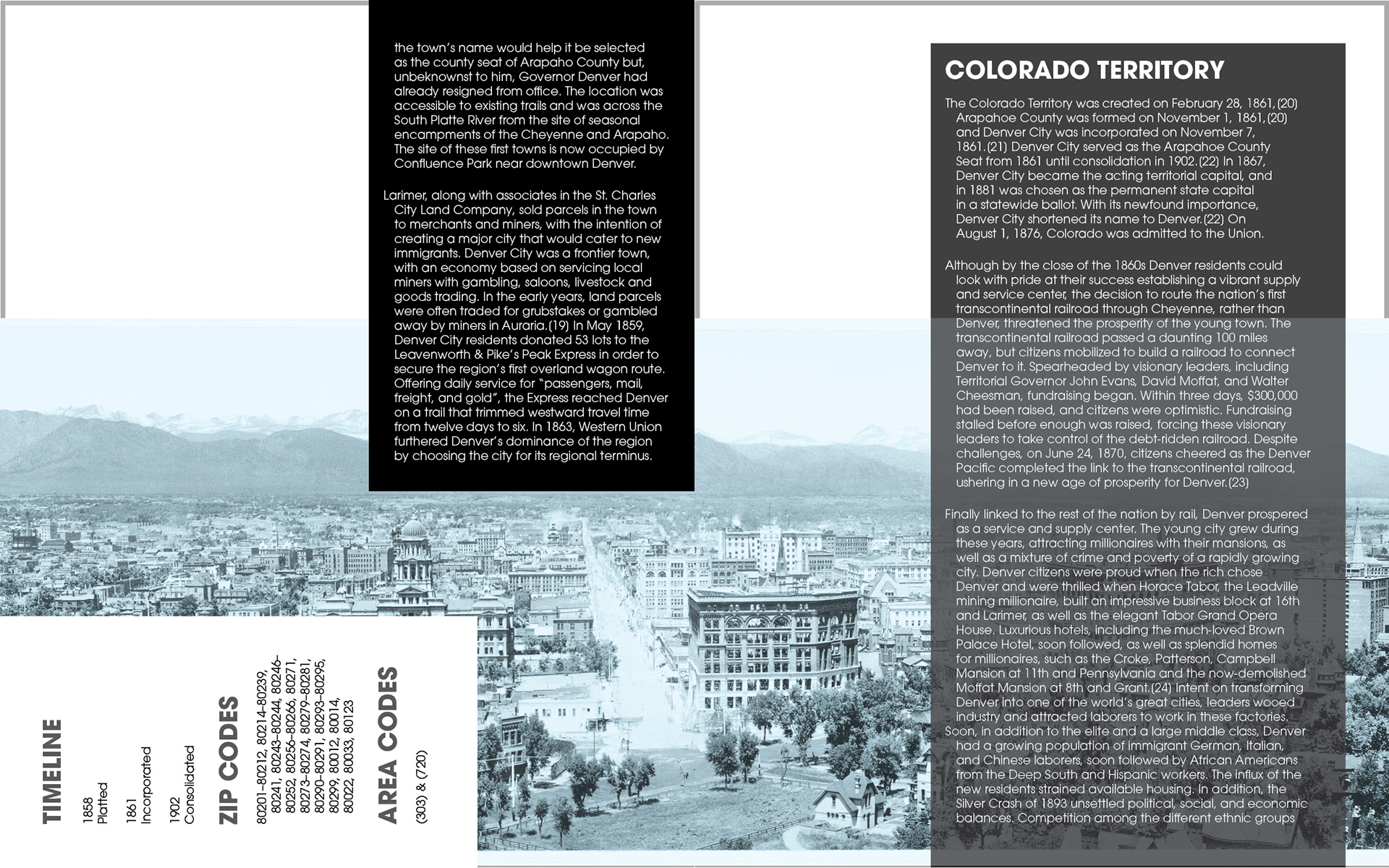
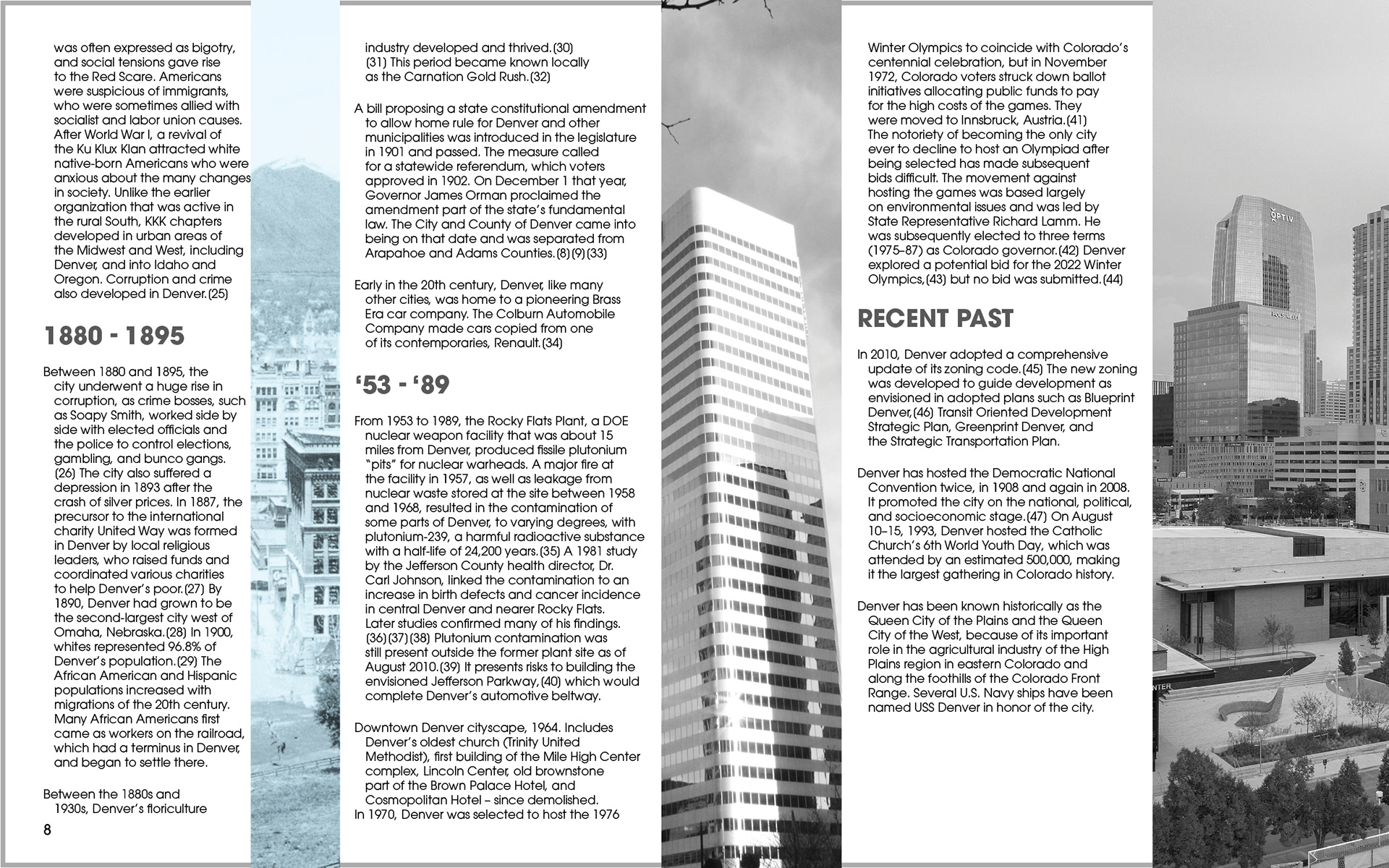
I turned to leaders of the magazine world for inspiration on each layout, with my focus on quality typography, and unique data representation. The effect already made the images distinct, so little attention was needed to make them pop.
I enjoyed the challenge of inventing something new for each spread and finding ways to represent data in a creative way. I feel that this design is important to me because it challenged every aspect of my design skills, from storytelling to ideation. The final result strikes a pleasant balance between usability and experimentation within the parameters.


I found that utilizing sidebar content within the Wikipedia article worked well to offset the large blocks of text. Incorporating that content into the design helped me visualize the information and create contrast. The design also reflects the character of the topics, feeling more traditional for the history portion and more modern for the economy section.


